
It’s time for a clear visual
Examining the components: Visuals
Like typography, the choice of imagery and style in which your artwork is presented can also help shape the context and feel of the campaign’s idea. Does your campaign want to live in an organic world? A highly structured and clean world? Is it a busy world? A serene one?
This is the component that, for the most part, has to communicate an idea without words. It’s about how a photograph is shot and manipulated. Or how an illustration is illustrated and designed. It’s also about creating an environment for our headline, body copy and logo to live in. When all of those elements are moving toward the same goal, the results are a tightly designed and visually succinct campaign.
There are many visual cues an art director can use to help shape that environment: color, shape, space, line, form, the list goes on. Entire courses are taught on the theory and relationship of each of these elements alone. It’s important to learn and understand the nuances of how each of these elements can shape consistency of design.
Color: One of the most powerful visual tools an Art Director has in the toolbox is the use of color. Unfortunately, it’s commonly the most misunderstood. Understanding color begins with contrast. Color is best understood when juxtaposed to another color or lack of. Higher contrast between colors, yields more active and dynamic visual intensity or vibrancy. Lower contrast yields less intensity. There are appropriate uses of both ranges of contrast.
Choosing a color palate can be a subjective process but should not be chosen arbitrarily. If you have a general idea of how color works, you will end up with more control over how your campaign’s design is helping its concept.
In general:
- When using color/hue, high contrast can be achieved using colors opposite (complementary) of each other on the color wheel. Too much contrast using hue can create an optical illusion of movement, sometimes referred to as a vibrating line. A general rule is to not typeset in a color that is complementary of its background since it will make things very difficult to read.
- Low contrast is achieved using colors closer (analogous) to each other on the color wheel. Colors too close to each other tend to blend and not separate well.
- Monochromatic color schemes are created when you are using one hue juxtaposed with the same hue at a different brightness level and will behave similarly to analogous colors. Brightness is controlled by how much black or white is mixed with that hue.
NOTE: The print world works within a CMYK color space: Cyan, Magenta, Yellow and Black and is a subtractive color model that can be very limiting as opposed to the additive color model of RGB (Red, Green, Blue.) It’s not so important to understand the nuances of this color model for this class, but eventually, you’ll be sending files to print vendors and proofing will require some knowledge of how that model functions in order for you to communicate any adjustments.
Shape: This refers to the feel of your ad. Sometimes it is represented in fluid, rounded curves or type that follow a rounded edge vs. always staying within the given square boundaries of the page. Yes, your ad/design must to be within those confines, typically in a print ad. But within that space, you can change the shapes of visuals and type to create a whole different feel. And of course, there are products or services that this works better on than others so you will have to judge for yourself when to incorporate a different shape into the ad and when not to.
Grids: This term describes how to divide the page into a format, to section off space such as quadrants, columns, inches etc. It is asking yourself, how do you want to set up the quadrants; is one big and one small? Are there just four small ones? Or two big ones? Do you want the ad to read horizontally or vertically? Again this is subjective, but it is also built around the overall concept and product or service you are working on. Though the page won’t be literally divided up when a consumer sees it, it will take their eyes in a certain place and this all needs to be considered by the Art Director before just diving in, there is a thought process to this.
So all of the above is a bit of the technical side of thinking of your visuals and your space for them on the page. Now let’s talk for a moment about what you will chose to put on that page conceptually. As we mentioned earlier, the visuals in your ads can come in many forms. Photography, Illustrations and in some cases even a combination of both.
There is also a whole visual way of thinking that we call Incorporated Visual, where just as we saw in Week 2 with typography, the actual visual is a part of the concept itself. This is a very powerful way of thinking because the visual is usually quite captivating. Because the concept is wrapped right into the visual, it usually elicits a great response.
Let’s take a look at some campaigns where the visual element had a major impact on the overall ad’s appearance. We will see some that utilized photography or other visual elements and others that used that Incorporated Visual technique.
Watch this video of Nathan as he shows you a variety of ads and campaigns focusing on the visual elements of the ads.
Please print out the following document:
#1 Sample packet of various visual ad examples
Case Study
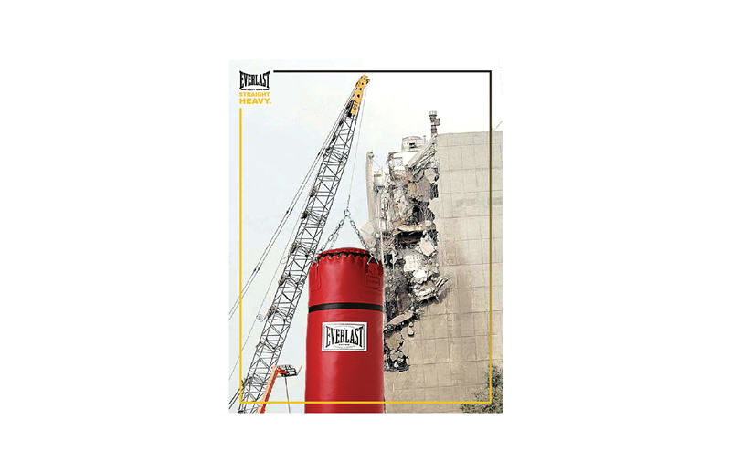
Let’s take a look at an actual progression of ads done by a student in The Book Shop School for Ads course in Los Angeles for Everlast. The “one point” of the ads was about how strong this punching bag is. You will see a series of seven ads and then the final campaign. Each round was a lesson in examination, trial and error and decisions about color, shape and type styles. But the final ads really worked well and allowed the Everlast punching bag to really make a statement.
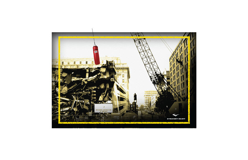
Let’s take a look at each round. The first round had the punching bag large and prominent on a crane, with the strength to be a “wrecking ball” and a crumbling building in the background. In round two, upon reflection, the Art Director decided to ad copy and a side panel to house it in. But the double imagery of the punching bag was too much. Which image is dominant? How do you know where to draw the eye first? Round three went in a new direction, with a screened back image of the building and a full color image of the punching bag on the crane. (Click on images below to enlarge).
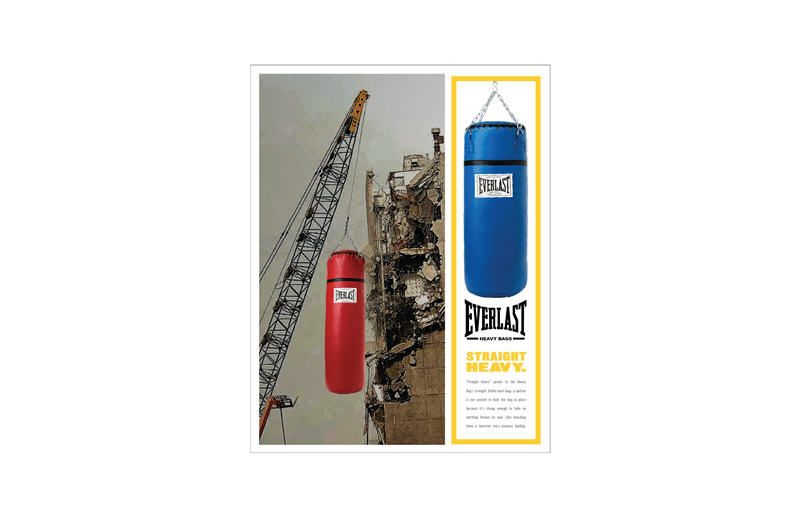
From there, the Art Director decided to bring the image into focus and add a bright yellow bar on the bottom to house the tag line and logo. While this was a huge improvement upon the dual images of round two, the bright yellow bar was distracting and the punching bag image became wallpaper.
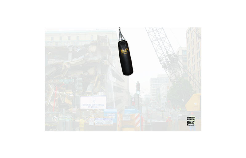
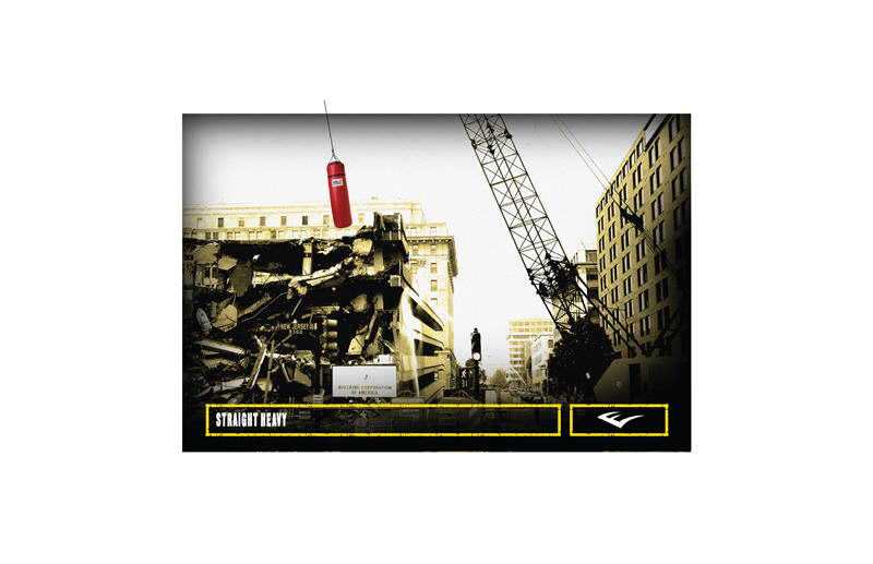
In round five, the Art Director moved the yellow element to a box around the ad and brought the punching bag’s color red into play. But the frame felt like too much distraction, again, it was fighting with the red punching bag. Round six went into a much cleaner direction with the simplicity of the box below to house the tag and logo. But then the Art Director tried a darker frame around the edges and reduced the yellow ingredient. Now the focus, the eye, clearly went to the product and what it was doing as a “wrecking ball”.
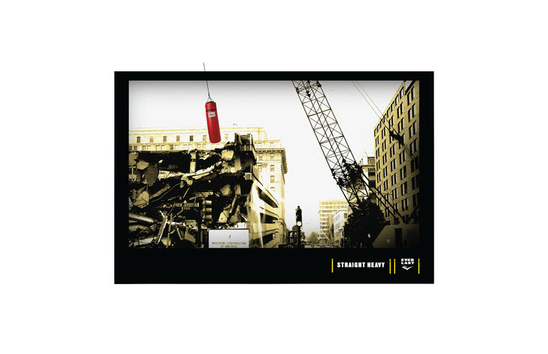
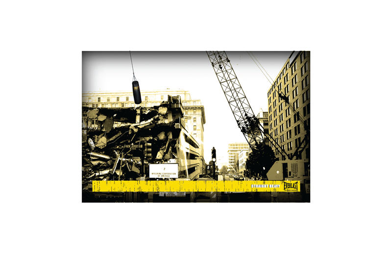
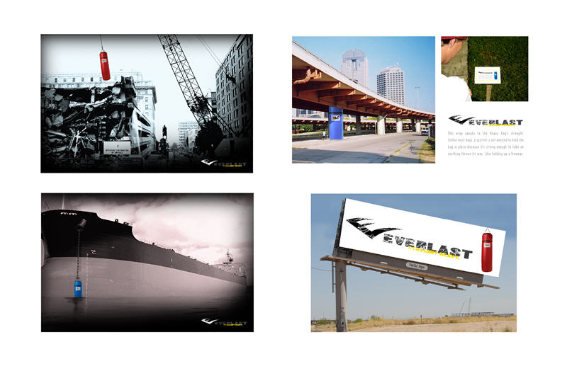
Still, when you look at the final ads done for this campaign, the Art Director took out the heaviness of the black border and kept it softer at the lower corners and used a gray pallet to really make the red punching bag pop. In the second ad, with the punching bag as a ships anchor, the color tone was deeper and the punching bag a popping blue. And a third ad was at work at press time! But the transformation is remarkable. As you can see, the rest of the work here was an outdoor board and some innovative/Guerilla pieces: one that has the Everlast bag as a freeway underpass pillar holding up the actual freeway with its strength. So all around great thinking and worth all of the trial and error it took to get there.
Assignment #3: Visual Thinking
Again, look back over your concepts/ads or campaigns that you have done so far in The Book Shop workshops or other concept courses elsewhere. You should choose one of your own campaigns that you have done to work through the process as seen in our case study above. Take your time with this and don’t rush it. If it takes more than a week to complete, so be it but you can send your Instructor where you are at for some feedback near the end of the week if it is taking you longer. You saw from the above case study that this takes dedication and practice to come to a final round that you’ll love to put in your portfolio.
Click to enlarge and view some of the ways our students designed their ads. The examples shown are just one way to go, the way these student Art Director’s chose to go. You may of course go in a whole other direction depending on your product or service and that’s great.
Now let’s discuss the student ads for this assignment. First, let’s look at those that used various forms of photography:

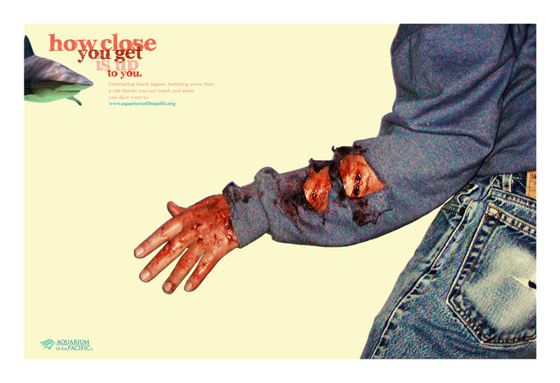
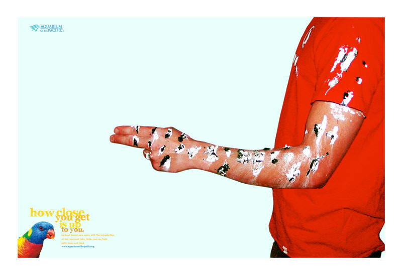
For the aquarium ads, this final round (there would be too many ads to show of all the rounds for each of these student assignments, so these are all the final ads) has the main dominant visual be the person who is either covered in stings from a stingray, a bite from a shark or poop from a bird. All humorous ways to get the “one point” across that “how close you get is up to you.” None of the images are fighting with each other and the decision to go with a spread further ads to the concept by allowing the person in the ad to take up a lot of space to clearly show what happened when they got too close to the animal being discussed in each ad. We will be spending a whole week on spreads in week 5 because it is, in and of itself, a whole other way to think about your ads and the space that you can utilize. But for now, this campaign for the aquarium is clean, easy to follow and well art directed.
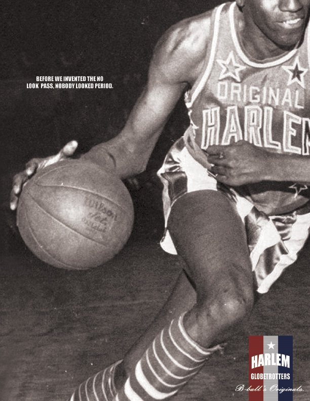
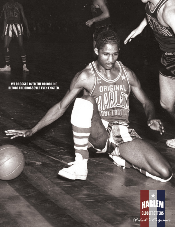
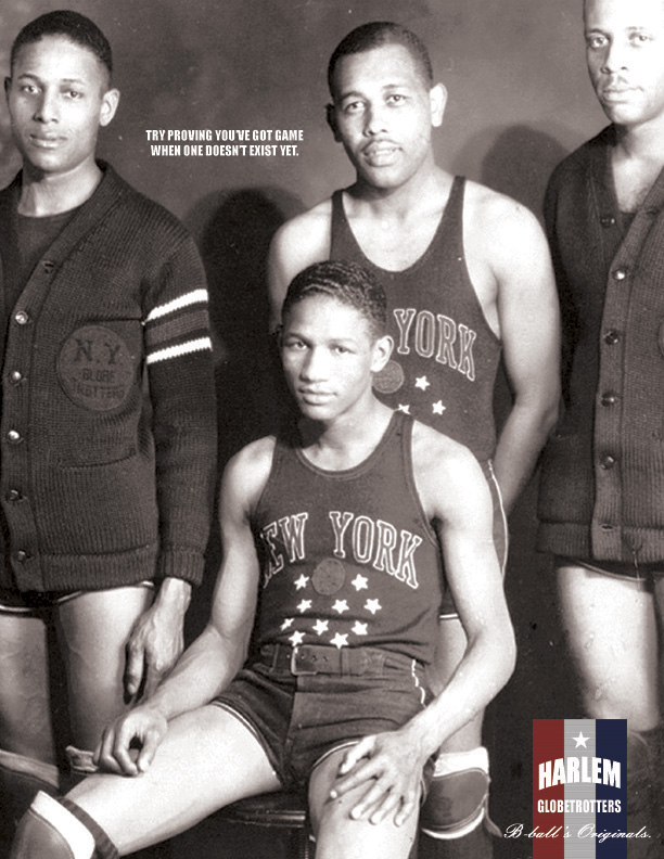
The second campaign here is for The Harlem Globe Trotters (basketball team). The whole “one point” strategy here is the history behind this team. The Art Director’s choice to use black and white photography demonstrates that history beautifully. It is a clean, simple campaign to understand and the look ties in with the overall concept of the campaign.


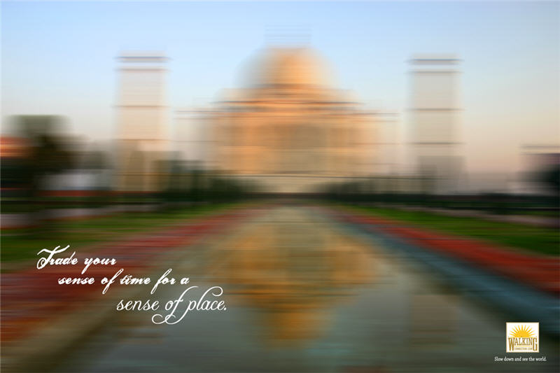
The Walking Tours campaign was also well thought out. Typically, you might expect to see some beautiful scenery shots of places you could go on these tours. But instead, the Art Director played off the concept of how much you could miss if you don’t walk, by showing the visuals in a blurred, rushed style of photography. Again, a very deliberate choice of visuals that ultimately made for a great campaign.
Now let’s look at some of the student ads in the Incorporated Visual style:
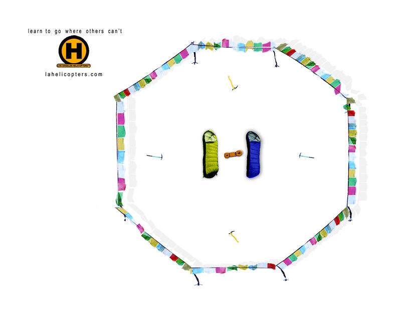
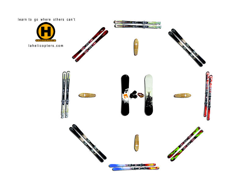
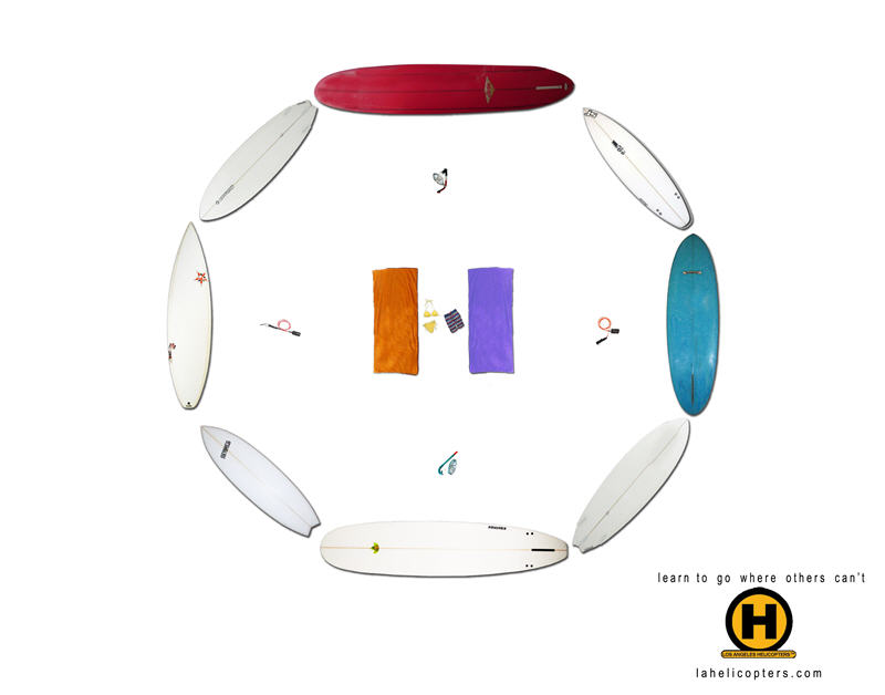
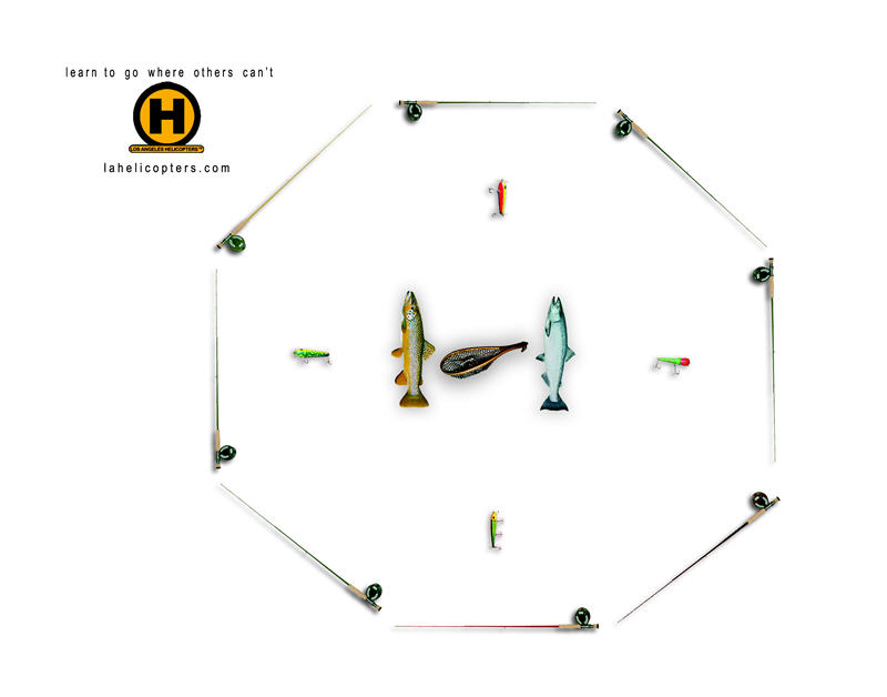
The first is for LA Helicopters, a company that let’s you rent out a helicopter to pilot you to places you couldn’t get to on your own, as well as other benefits of the service. But this “one point” of getting to those hard to reach places where you enjoy your sport of choice, is the focus of these ads. Here, the visual itself looks like a helicopter landing pad but it is visually made up of all of the elements involved in that particular sport. So in the first ad, we see the landing pad is made up of sleeping bags and hiking flags for those adventurous hikers who want to rent a helicopter to take them way deep into the mountains so they can carve their own trail. The landing pad in ad two is made up of snow and ski equipment for those who liked to be dropped at the top of the highest mountain. And you can see how the rest of the campaign plays out accordingly. Again, very clean design elements and a smart incorporation of the visuals into a helicopter landing pad make this campaign visually appealing as well as a great concept overall.
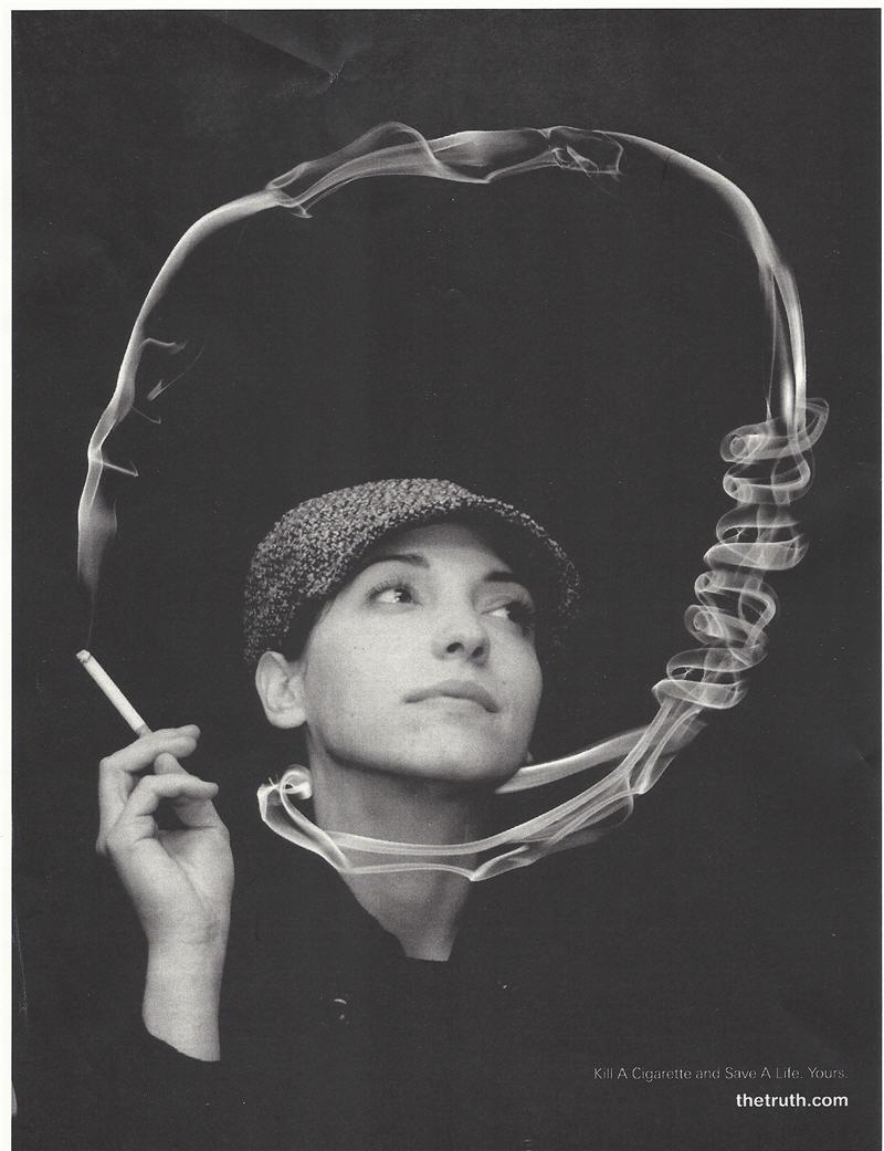
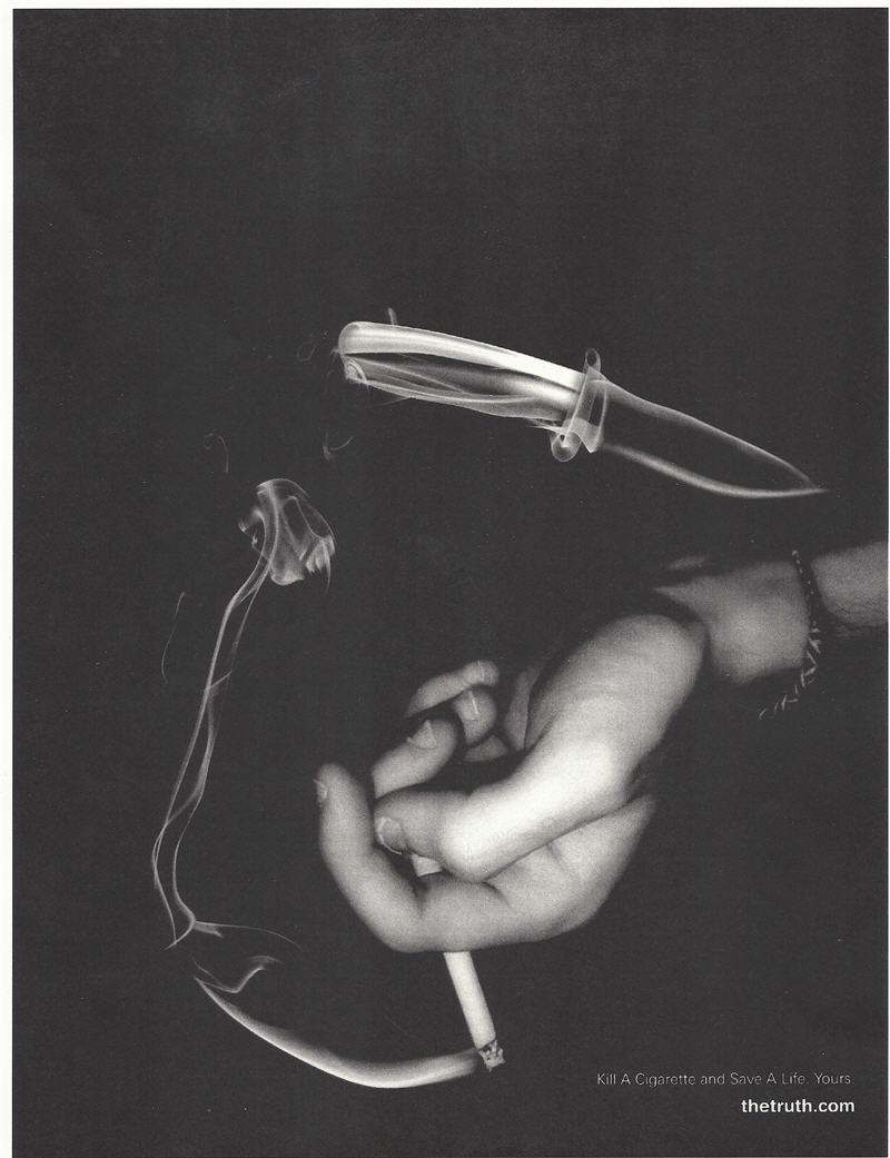
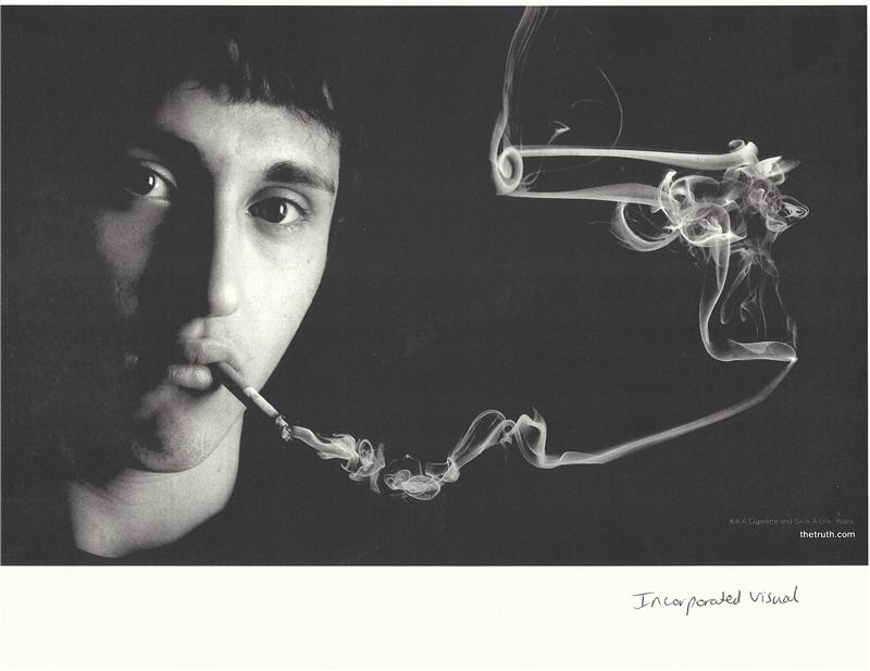
The next student ads we will look at here are those for thetruth.com, for anti-smoking. These ads are truly great. The visuals in all three are so compelling. And to actually think of using the smoke itself to show these various “weapons” in terms of what you are ultimately doing to yourself when you smoke, is really brilliant. It is another great example of how this style of incorporating the visual (the product or service’s actual “benefit” or strategy) right into the ad is a great way to think of doing a campaign or two for your portfolio.
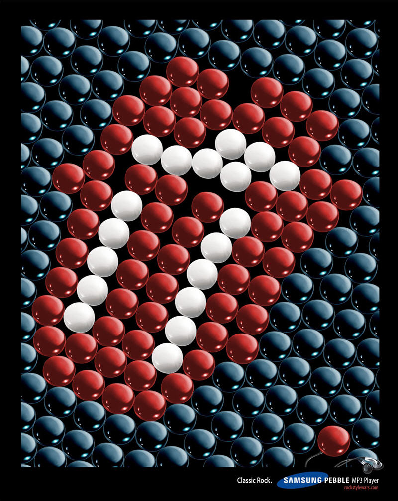
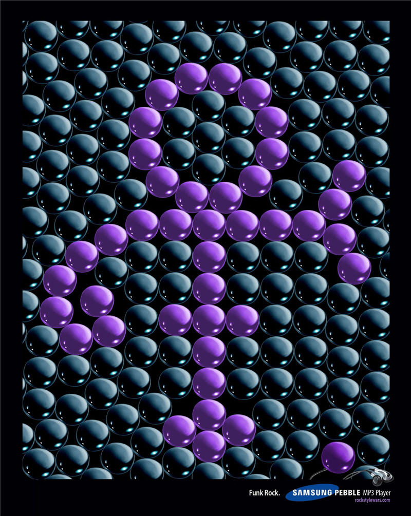
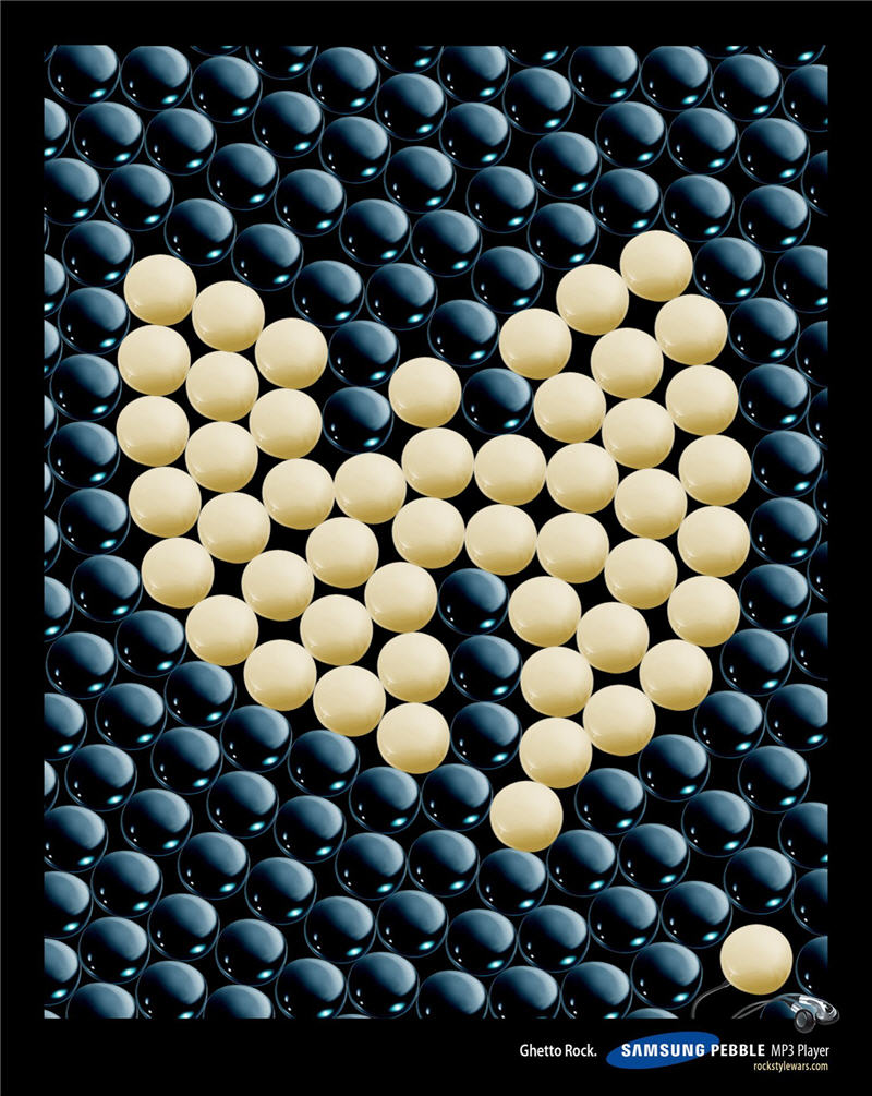
And the final student ads we will look at are for Samsung’s MP3 Player called Pebble. All of these ads incorporate the visual of pebbles that make up artist’s logos. The first is for classic rock, with the Rolling Stones. The second is for funk rock for Prince and the final ad is for ghetto rock for Wutang Chan. The use of the pebbles to make up the artist’s logos is very clever and appealing and works well as a way to incorporate the visual concept into the ad.
Just remember, it takes quite some rounds to get to the place that these assignment examples above show you. But it is all worth it when you not only get non-stop compliments on your portfolio, but tons of job offers to go with them.
Take a shot at designing your own ads this week and then send what you have to your Instructor for feedback. If it is still a work in progress, that is okay. Just let your Instructor know that when you send them and that you want their feedback thus far as to the direction you are going in. Once you have heard back from your Instructor, then move on to Week 4. You can always come back to this assignment later and continue working on your ads to improve them for your portfolio now that you understand the way this works!